Embed a Formant view in an external site
This guide assumes knowledge of React and TypeScript.
You can configure a view in Formant and embed it in an external website. You can integrate a Formant view within your applications, and apply custom styling to white-label the Formant view.
This guide will teach you how to embed a Formant view into an external web application.
Steps 1 through 4 contain instructions and reference materials for various customization options in an embedded view. The Example section contains documentation on our interactive code sample for an embedded view hosted on Storybook.
Prerequisites
Build a Formant view
Before you can embed a Formant view in an external web application, you'll have to create a view. For more information, see Create a view and add modules.
Embedded views only work with Formant Coherence viewsBe sure to create an Observability (v2 beta) view as described in the link above, and NOT an Observability view as described in the Getting Started section of the documentation center.
Generate an auth token which sets access levels
A valid authentication token is required to access data in an embedded view. You will set the access level for devices, data, and entities when generating an authentication token for that session. For more information, see Generate an auth token for an embedded view.
Step 1: Install the Formant embedded view package
Run the following commands to install the Formant embedded view package:
npm install @formant/view-embed-react-wrapper
yarn add @formant/view-embed-react-wrapper
Step 2: Generate React code for your Formant view
- Navigate to the view you want to embed.
- In the view header, click the arrow next to the view name >> Embed...
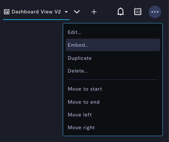
Embedding a view.
- You'll see a pop-up window with a code sample.
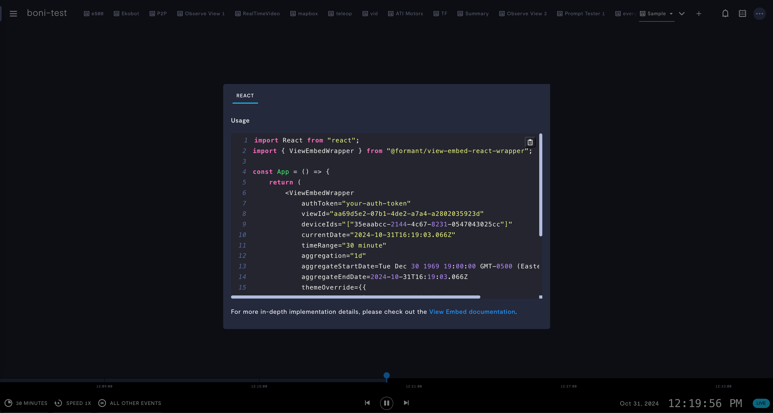
After clicking Embed...
Step 3: Create React application which embeds your Formant view
Once you have the React package installed, you can copy the code in the Usage field and paste it into a React application to embed your view.
The parameters for the embedded view are as follows:
Parameter | Data type | Usage |
|---|---|---|
|
| |
|
| ID of the view you want to embed. |
| Tag set (see below) | Modules in your view will be populated with data tagged with this tag set. If you also provide If you do not provide To maintain access control, all tags applied to service account, authentication token, and |
| List[ | IDs of the devices related to the embedded view. Modules in your view will be populated with data from this device. Either this parameter or |
|
| Length of time spanned by the timeline in the embedded view. Options: |
|
| Time aggregation for data presented in this view. Options: |
| Start date for the aggregation period. | |
| Date | End date for the aggregation period. |
| Date | Date and time to view. |
| See Step 4. | Custom styling for your embedded view. |
| CSS | Custom styling for the wrapper element. |
viewTags have the following syntax:
viewTags = {
  "tag-key-1": ["tag-value-1"],
  "tag-key-2": ["tag-value-2", "tag-value-3"]
}
This would show data tagged with tag-key-1: tag-value-1 AND (tag-key-2: tag-value-2 OR tag-key-2: tag-value-3). For a complete reference and more examples of tag syntax, see Generate an auth token for an embedded view: data and entities syntax.
Default values for optional parametersIf not specified, the values for optional parameters listed above are inherited from the configuration of your view in the Formant web application.
This does not apply to
themeOverrideandwrapperStyleOverride. The default value forthemeOverrideis the default Formant style. The default value forwrapperStyleOverrideis the default iframe style, which includes a border.
Step 4 (optional): White-label your interface
ThethemeOverride property contains the following parameters:
{
  fontFamily: "Oswald",
  fontFamilyUrl: "https://fonts.googleapis.com/css2?family=Oswald:[email protected]&display=swap",
  colors: {
    "color-primary-background": "#2D3855"
  }
}| Parameter | Data type | Usage |
|---|---|---|
fontFamily | str | Font family to use in UI text. |
fontFamilyUrl | str | If you want to use a non-standard font family, provide the URL to the font family here. |
colors | CSS | Modify text, data, and background colors in the embedded view. |
You can use the themeOverride parameter to white-label your embedded view.
For a detailed exploration of the available parameters for
colorsand the UI components they control, see Custom CSS variables.
Interactive example
To see an interactive example of an embedded view, see Storybook: View Embed.
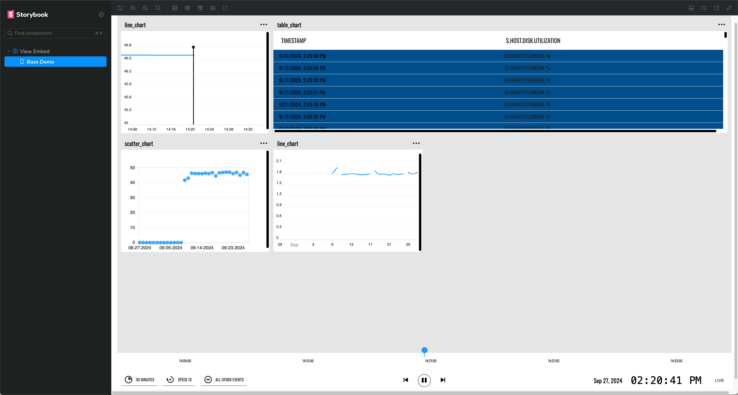
Interactive, live example of an embedded Formant view in Storybook.
Customize the example
You can update the variables in the source code and customize the example using the Controls tab:
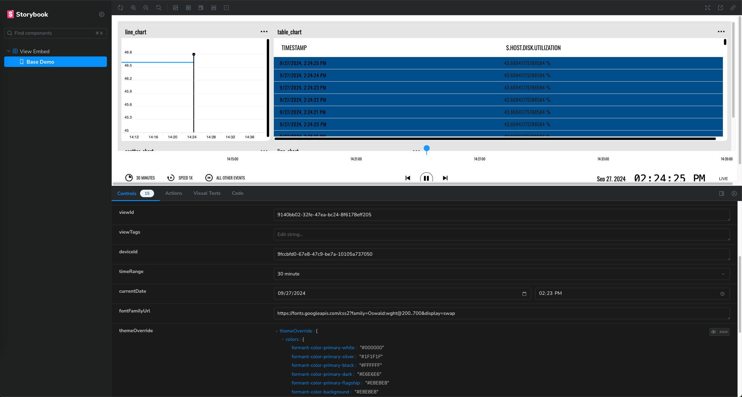
Customizing the example in the Controls tab.
Source code
You can see the source code for the example under the Code tab:
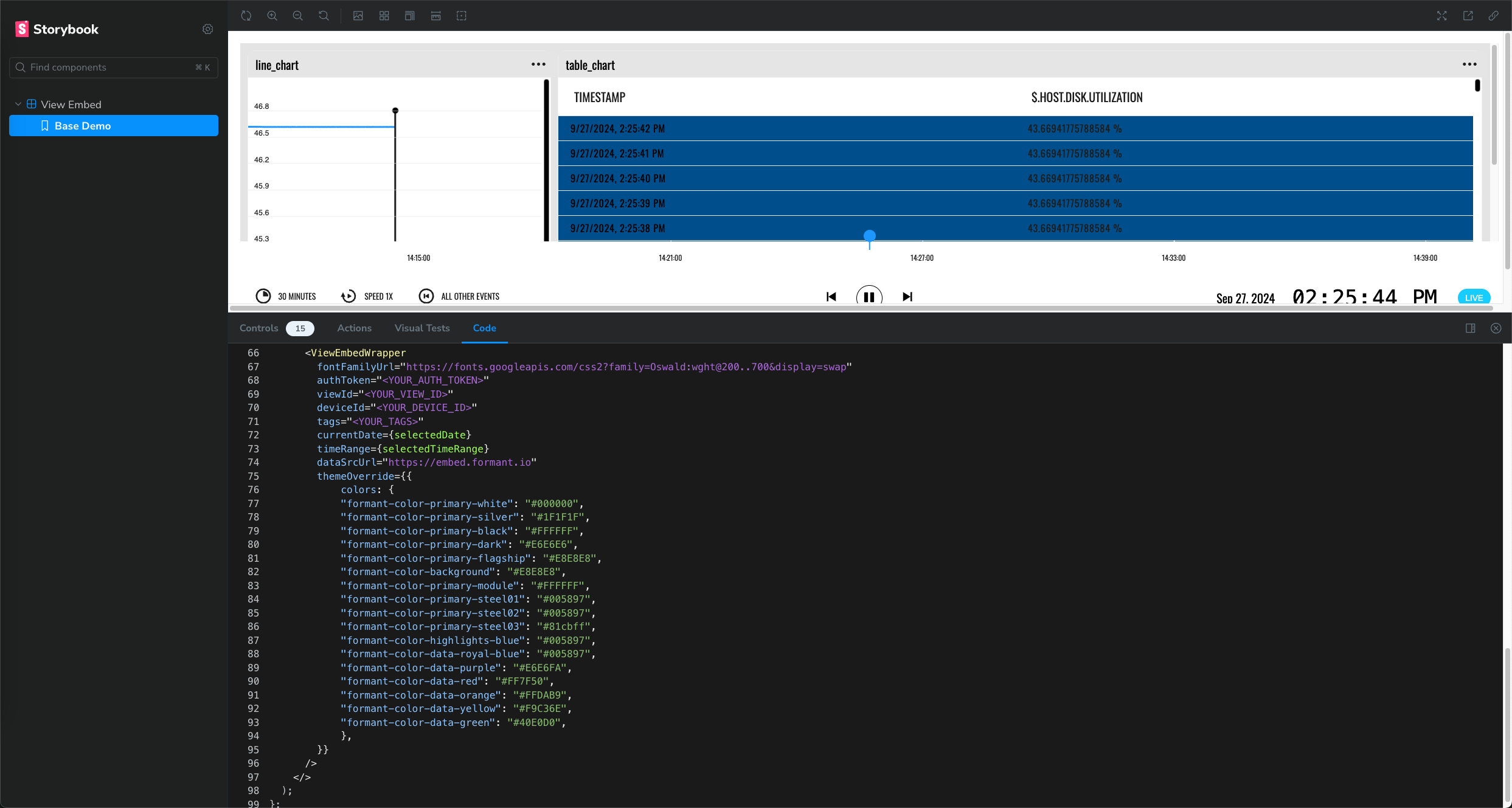
Viewing the source code of the example.
See also
If you notice an issue with this page or need help, please reach out to us! Use the 'Did this page help you?' buttons below, or get in contact with our Customer Success team via the Intercom messenger in the bottom-right corner of this page, or at [email protected].
Updated 6 months ago
